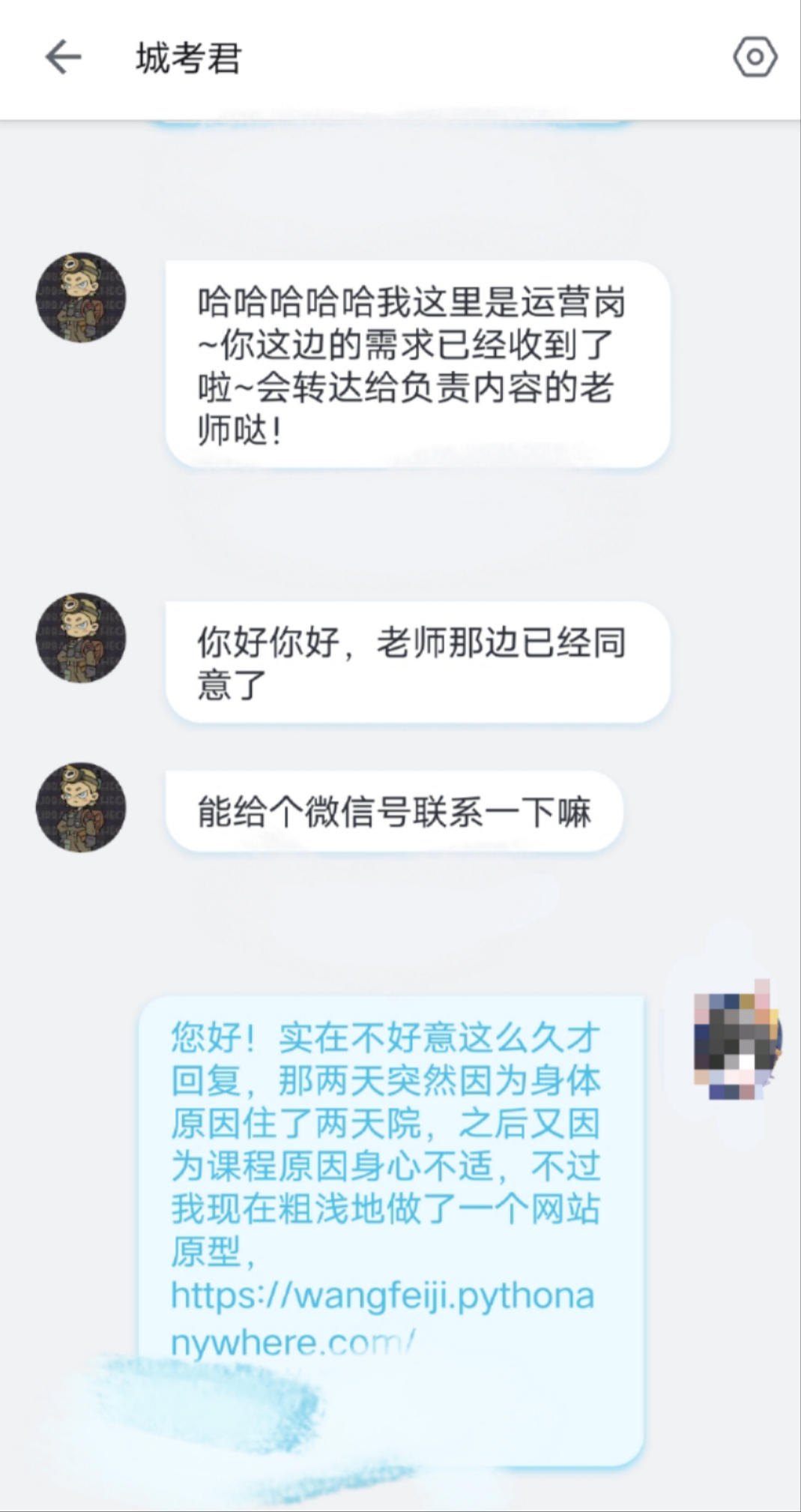

“城考君”is a company in Shanghai providing city walk guidence service. They would conduct city almost every week, and the charge is about 150 Yuan per session. What I want to do is to find some support from them.
My usability test questions are as follow:
1. where you can click to find out the proper routines?
2. Sharing your traveling experience
3.look for the interesting buildings you want to go?
4.log in
5.If you want to conduct an offline city walk, what would you do?
6.would like to pay for the routine guide service?
During usability test, I found that many of the participant cannot find the login button. Also, "Blog" might be a little confusing for the users in mainland. A participant mentioned the button "點擊開啟線下城考!" looks like a downloading button, so he won't click it. The test actually make me changed my idea of monetization.
In the A/B test part, I made some changes mostly in the navigation bar. In my monetization plan, except for the additional information,
the main value of the membership is the discount on the offline city walk guide service. So I am wondering which one should be placed in the most conspicuous position in the navigation bar, the Login button or the "點擊開啟線下城考!" button that points to the service directly. In the B version, I enlarged the sign up button and placed it in the top right corner of the page.
The result of the A/B test showed that it might be better to remain the original design. The orginal design obtained higher conversion rate.
For more information, please click
here